Showing posts with label Graphics. Show all posts

Tuesday, April 1, 2008

Gateau Tour de Summer


Gateau Tour de Summer

Altered Art Painting

by Chris Plastic
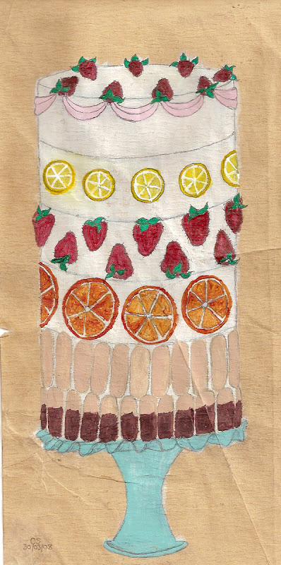


This fantastical cake is painted in acrylics

on a piece of moderately distressed paper.

(If you think that’s heavily distressed,

you haven’t seen some of my other work.)


This prelude to summer is loaded with strawberries

and orange and
lemon

slices.

The lowest tiers are layered with lady fingers,

the bottom row of which are dipped in chocolate.

To complete the effect, this magnificent culinary delight

sits proudly atop a vintage blue milk glass pedestal with a scalloped rim.


The overall size of this piece is 6 x 12",

so it will definitely command attention wherever you put it.

The colours have been meticulously blended

to create vibrant tones that jump off the paper.

Keep in mind this has several sharp creases,

as well as other rough spots, including a tear on the left side.

All this has been done to add to the character of the piece.

As you can also see from the above image,

the painting is initialed and dated at the lower left corner.


~ THANK YOU for stopping by! ~


Be sure to check out my other listings.


This design and many others are featured

on a wide range of merchandise in

My Cafe Press Shop!


Monday, March 31, 2008

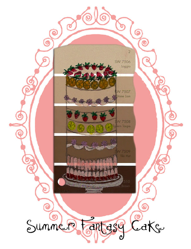
Summer Fantasy Cake

Summer Fantasy Cake
Altered Art Painting

by Chris Plastic


This is a fantastical cake painted in watercolours on a paint chip.
It is loaded with strawberries and orange and lemon slices.
The lowest tiers are layered with lady fingers,
the bottom row of which are dipped in chocolate.

The paint chip has not been altered, other than by my painting,
in other words it has not been cut and the hole at the
bottom left was there originally.
Also note that the above image has been formatted
with the frame and title
to personalize the setting here.
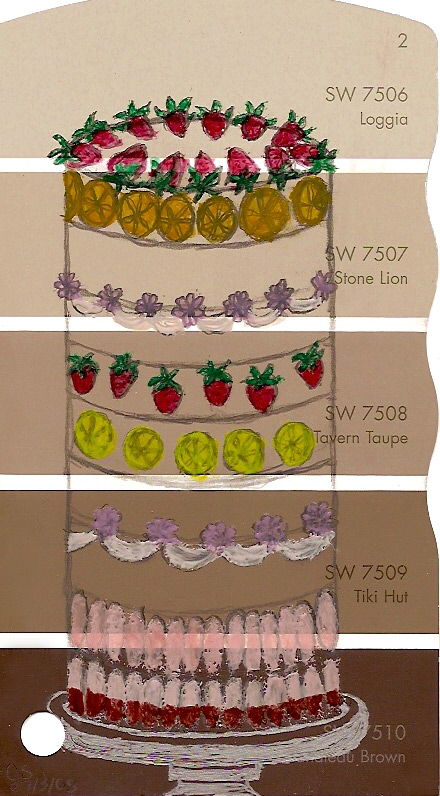
Below is how the painting actually appears,
although a bit smaller and the colours
not quite so saturated.
Also the flowers are more pink,
as opposed to the mauve they appear here.


Due to the nature of the piece, there could be no corrections,
so this was all very carefully sketched on here
and then delicately painted.
The piece is 3 x 5 3/8" and is initialed and dated
at the bottom left hand corner.
It will have a clear coating applied so that painting doesn't rub off.

The original of this item is listed on eBay
and there is also a section in my Cafe Press shop
with a number of items
featuring this design.


~ THANK YOU for stopping by! ~

Be sure to check out my other listings.


Friday, February 8, 2008

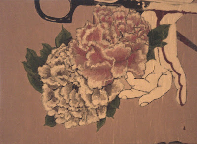
Fresh Cut Valentine

This one sure was fun! I figured I'd throw together a Valentine themed painting, so for the last two days I've been working on this sweet little number. It's something I've never done before, so once again I didn't know if I might be biting off more than I could chew, but what the hell.

Actually, I have drawn flowers before, just never painted them. But I figured it couldn't be too different than anything else I might paint. And there were lots of nice lines involved, which is always a plus. Once I got started on the actual painting, it occurred to me that maybe I'm a glutton for punishment. I mean, all those lines sure look pretty, but try painting within them! Gahhh! So when I finally hit call it a "night", I may not be resurfacing for a little while, coz my eyes are gonna need some time to recover from all that strain.

As far as the style of this painting, I'd consider it to be...Gothic Romanticism? Mock Romanticism? Gothic Pastoral? Well, something along those lines. Basically the idea was to take something benign - something pretty and romantic and juxtapose it with something a little macabre. What could be more fun? Especially for Valentine's day! So without further ado, I give you:

Fresh Cut Valentine


Yes, I know, shite photos. What else is new? I'll get the bloody thing scanned later so you can see all the gory details. What you can't see here, aside from accurate colours, is that I have incised the board numerous times to give a sort of distressed/woodgrain effect. I think it kinda goes with the painting alright.

Ok, enough o my drivel. I gotta either crash or puke and I don't care to have that acidic taste in my mouth for the rest of the day, so I think I'll crash. So come and tell me stories of unrequited love or bring me flowers or cupcakes. Or just come and say hi and ignore the painting. Oh yah, it does happen.

Good night!

Oh! By the way, this painting is 5 1/2 x 7 1/2".

And now night must fall...

Friday, November 9, 2007

Mitt Graffiti

I had this piece formulating in my mind for a while and it all came together the other night. I'm pretty pleased with how it turned out, but I won't be sure until I actually make prints of it. I'd previously planned to do some of my prints as murals, but I think this one particularly loans itself to that, so I just might go ahead with it. So if anyone wants a mural of this print or you know somewhere that could use one, just let me know and I'll see what we can work out.


Thanks for looking!


Tuesday, August 14, 2007

At What Price, Liberty?

Today I decided to revisit a collage piece that I'd had on the backburner. Sometimes I just have to put things aside to gain some perspective on them or to let them come into focus more clearly. This was one of those projects. And I'm glad I decided to put it aside, rather than try to force it when I originally started it, as I think the end result is much more coherent.

You might perhaps notice a recurring theme? I'm not sure how much longer it's going to be holding court here, so I guess I'll just ride it out and see where it's going. I have some other ideas floating around, but so far they're just enticing me, so I really don't know when they'll be joining the party.

So without further ado, here's today's offering!

At what Price, Liberty?


(I expect you'll want to click the image for a closer look.
There's a LOT of detail in the border!)


It's a Good Thing I'm Picky!

I'm not gonna lie, I'm kinda embarrassed about the earlier incarnations of my current collage. Now that I've taken a good bit of time to rework the colours, I feel that the image has a lot more punch. While it's all well and good to use a few vibrant colours for visual appeal, it can distract, not only from the image itself, but from the underlying message. So I think the reworking of this image has really helped, both with the impact and the message. Before the colours were a bit muddy, aside from being a bit distracting. Sure the glaring brightness might have pointed up the irony of the image, but I don't really think that needed highlighting. Also I think the previous colour scheme competed with more than complimented the image.

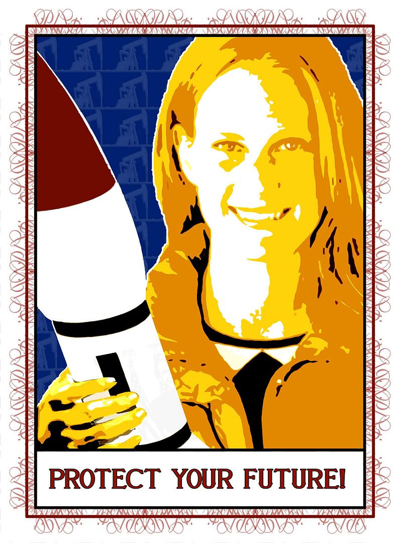
Now the only problem is deciding which of the later variants I like best. There are three contenders, but for me it's a tie between two of them. I do already have in mind which one I prefer, but I wonder which one appeals most to others. So here are, what I believe to be, the final three variants of Protect Your Future.


Sunday, August 12, 2007

New Artwork!

I think this is finished. I'm going to post it here anyway and, if it turns out that I decide it needs tweeking, I can always post the revised image later.


(CLICK IMAGE TO VIEW LARGER)


Monday, August 6, 2007

Plastic Dreams: A Beginning

While I have worked under the moniker of Plastic Smile for several years, I have yet to form a web presence specifically for that venture. So perhaps this can be a start.

I've spent a good portion of this past week getting an online shop up and running through Cafe Press and am very excited to see how it takes off. A lot of that time has been taken up with applying images to items and getting the layout organized. Hopefully I'll figure out quicker ways to do that, but in the meantime I've managed to make a good number of products available through this shop.

Here's a picture link to my shop: