I'm sure you were wondering if that title was inspired by the novel, Do Androids Dream of Electric Sheep, upon which the movie Bladerunner was based. The answer would be yes! In fact it could be an answer to the question of that novel's title. Certainly it is the title of the painting that I finished this evening.
Once again, this painting was done over two days, though this one wasn't quite as time consuming. Last night I built up the washes that make the background. Layers of blue, blue green, blue black, and maybe even a rubbing of some black. When I was happy I'd applied enough washes, I set it aside to dry over night and put my tired eyes to bed.
When I got up this morning,bright eyed and bushy tailed, I immediately picked up my miniature canvas and proceeded to plot out the subject on it. I knew what it was going to be and how it would be placed, I just didn't know how much of the figure it would involve to achieve what I wanted. So that took some fiddling and I actually ended up allowing the figure to take up more of the space than I'd originally envisioned.
Once I'd finally worked out the placement it was time to lay down the sketch and get out the paint brushes. The paintjob on this one is thankfully a lot simpler than my last painting. Yes, I said I probably wouldn't be attempting to paint metal again any time soon, but that was before I accidentally discovered that when water is applied to the metallic pen I used to outline the figure it turns to a wash! Who knew!? So this opened up all sorts of possibilities.
Now armed with this new secret knowledge, I was prepared for what would've been the daunting task of rendering the metal surfaces of this melancholy being. I was even able to acheive some subtle blending of a couple of metallic inks to add some slight hints of dimension. And now I get to share with you the results of this awesome discovery!
Once again, this painting was done over two days, though this one wasn't quite as time consuming. Last night I built up the washes that make the background. Layers of blue, blue green, blue black, and maybe even a rubbing of some black. When I was happy I'd applied enough washes, I set it aside to dry over night and put my tired eyes to bed.
When I got up this morning,
Once I'd finally worked out the placement it was time to lay down the sketch and get out the paint brushes. The paintjob on this one is thankfully a lot simpler than my last painting. Yes, I said I probably wouldn't be attempting to paint metal again any time soon, but that was before I accidentally discovered that when water is applied to the metallic pen I used to outline the figure it turns to a wash! Who knew!? So this opened up all sorts of possibilities.
Now armed with this new secret knowledge, I was prepared for what would've been the daunting task of rendering the metal surfaces of this melancholy being. I was even able to acheive some subtle blending of a couple of metallic inks to add some slight hints of dimension. And now I get to share with you the results of this awesome discovery!
AndroidsDreamOfAcidRain
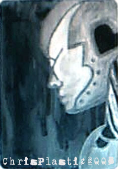
Unfortunately I had to resort to using a webcam pic for this post, but I will scan the painting in the morning and hope to god it comes out much clearer, as this picture just doesn't quite capture it. Oh and the type at the bottom isn't actually on the painting. Once I'd photographed it and colour matched it as closely as possible, I noticed that I'd not signed the painting yet, so I decided to just add a text layer to it, rather than wrestle the webcam again.
Thanks so much for stopping by!